

Google UX Design Professional Certificate: Project 01
The product
TinyVitals is an app designed to help parents, guardians, and caregivers receive requests for their children’s medical records, manage due dates, browse saved files, upload and save new files, and submit records for processing by the schools, camps, and activities.
Project duration:
May 2025 to July 2025
My role:
UX Designer
Responsibilities:
User Research, User Journey Mapping, Information Architecture, Wireframing, Prototyping, Usability Testing, Accessibility Design, UI Design
The problem
Create an app that simplifies receiving, organizing, and submitting medical records from one easy-to-use platform.
The goal
Caregivers struggle to manage and submit children’s medical records due to scattered requests, missed deadlines, and lack of a central system.

User research
Summary
Due to limited access to real-life parents and caregivers, I supplemented my research by using AI tools to simulate early-stage interviews and personas. This allowed me to explore a broad range of caregiver needs, behaviors, and edge cases quickly, while grounding the insights in existing literature and secondary sources.
Pain points
Overwhelmed by fragmented care tasks
Users are overwhelmed by juggling fragmented care responsibilities without integrated or intuitive tools to streamline the load.
Anxious about mistakes from confusion
The emotional burden of potentially missing a critical milestone is intensified by opaque systems and poor communication from institutions.
Ashamed by comparisons with others
Shame, embarrassment, and fear of being seen as a “bad parent” are heightened when systems expose their lack of preparedness or knowledge.
Unsupported, confused, and feeling alone
Users feel alone and unsupported, with systems and people around them assuming competence instead of offering accessible help or guidance.
Personas


User journey map

User Flow

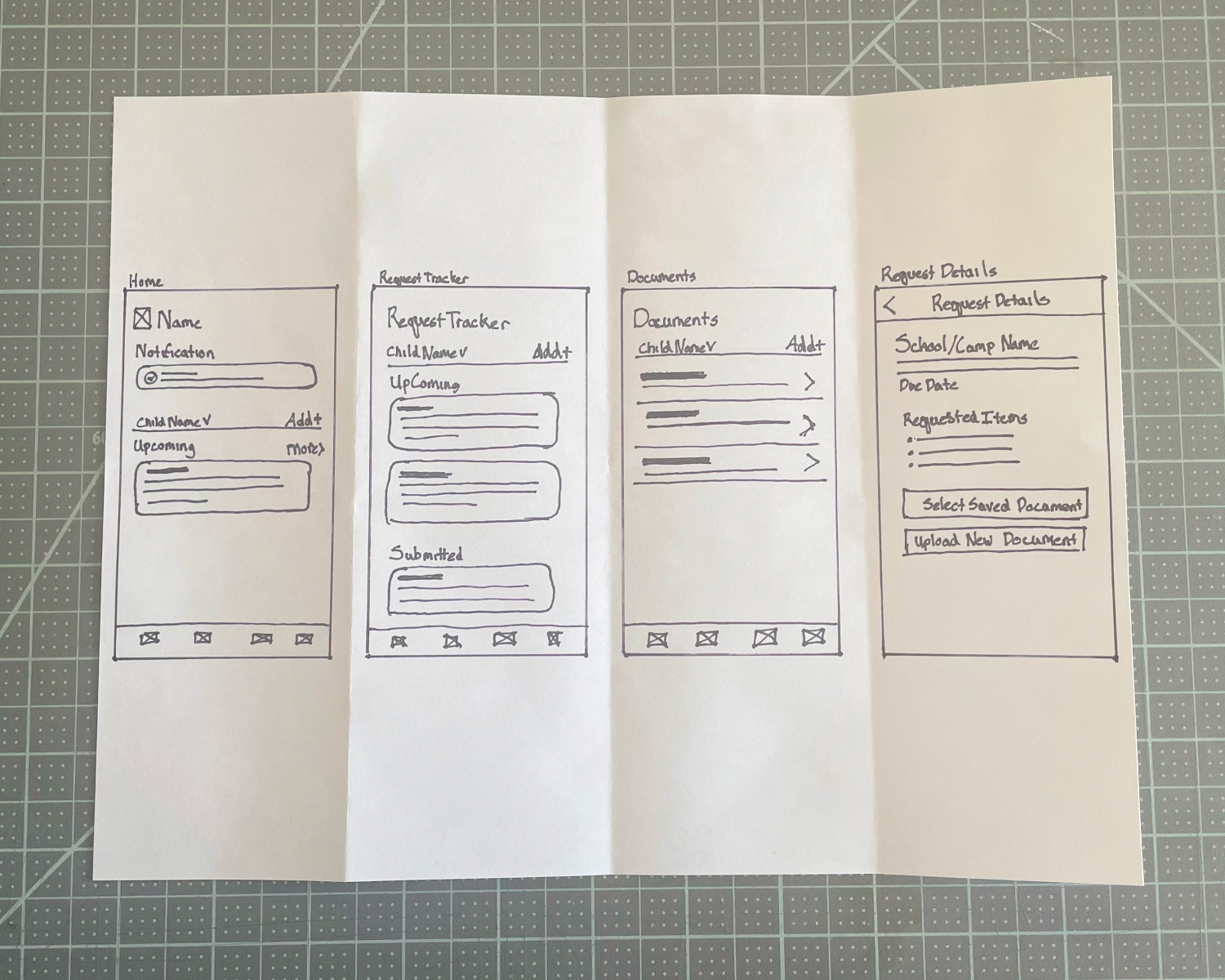
Paper wireframes
Sketching multiple versions of each screen on paper allowed me to explore layout options and ensure the digital wireframes addressed key user needs. This included designing multiple entry points to the request details page, and making it easy to switch between children or add a new child.
Digital wireframes
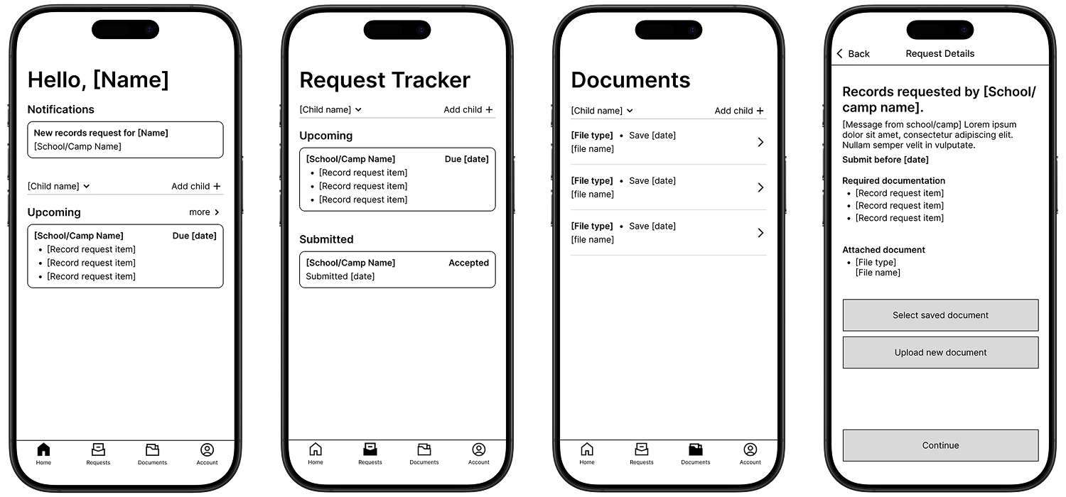
Wireframe Prototype
Usability study
Moderated usability testing was conducted on the new records request flow with five participants over Zoom. The group included a mix of colleagues and friends, two of whom work in healthcare, providing a range of perspectives relevant to the app’s context.
Round 1 findings
Users wanted a “Confirm and Submit” page.
Users wanted to see what a Records Request looked like after documents had been submitted.
Users wanted the ability to add new documents any time, regardless of which child’s profile they were currently on.
Round 2 findings
Users wanted notification that documents had successfully been attached.
Users wanted to be able to scan a document to upload.
Users wanted a sort button on the saved files page
Users wanted to be able to edit submissions that have not fully been processed.
High-fidelity designs

after second round of user testing

Document tab
Child Profile and Add Child buttons were redesigned to be more clickable.
A sorting button was added so users can switch between alphabetical order and date uploaded.
A tag was added to the document information if it was outdated.

Request Details screen
A notification was added to the Request Details screen after the user had successfully attached a document.

Other edits
Scan a document
The ability to scan and upload a new document was added to the Request Details screen and was made accessible from the Documents Tab.
Copy edits
Copy was edited on the Submission Confirmation screen to clarify what kind of notifications would be sent after a submission had successfully been processed and an explanation of the processing timeline was added.
Edit submission
An Edit Submission button was added to the Submission Processing screen in case documents need to be updated after being submitted.
High-fidelity prototype
Accessibility considerations
Plain Language for Clarity
All text throughout the app was written using clear, concise language to support users of varying literacy levels and reduce cognitive load during task completion.
Contextual Help and Overlays
Interactive overlays were designed to provide brief, plain-language explanations of medical record requests, helping users understand what’s being asked without leaving the screen.
High Color Contrast for Readability
Text and interface elements were designed with high contrast against their backgrounds, meeting WCAG 2.1 AA and AAA standards to ensure readability for users with visual impairments.
Redundant Visual Cues
Color was never used as the sole indicator for status or actions; icons, labels, and shape variations were added to reinforce meaning for users with color vision deficiencies.

Impact
Simplified Record Management
The final design made it significantly easier for users to track medical record requests, manage due dates, and submit documents for their children, all in one place. This reduced stress and confusion during busy times like school or camp enrollment.
Positive User Feedback
Users responded positively to features like the ability to categorize uploaded files and view the original request even after a submission was in progress or accepted. They felt the app was well-suited for parents managing records for multiple children. Peers described the experience as familiar and similar to apps they already use.
Demonstrated Potential
While the app was not built, the prototype effectively demonstrated how secure online file transfer could improve caregivers’ ability to manage the logistical and emotional challenges of preparing children for school and camps.
Reinforced Clarity Through Design
Usability testing confirmed that the use of plain language and color-coded request statuses helped reinforce clarity around submission progress and task completion.
What I learned
This project, alongside the Google UX Design Professional Certificate, deepened my connection to the UX process. Though I’ve designed for over a decade, it was my first time leading a project through the full concept creation phase, which I found both challenging and rewarding.
Working with limited resources pushed me to explore unfamiliar tools, including generative AI for early-stage research, and to empathize with users outside my daily experience. I gained a deeper appreciation for the emotional toll of paperwork on parents and caregivers.
I now bring this empathy, adaptability, and user-centered focus to every project; especially those that simplify complex or emotionally charged experiences.
If I were to continue to work on this project…
I would conduct usability testing with a diverse group of caregivers to gather real-world feedback.
I could explore partnerships or integrations with schools, camps, and healthcare providers to see how the app could fit their needs.
And eventually create a version of the prototype for tablet use or responsive web.
Google UX Design Professional Certificate: Project 02
The assignment was to create a responsive website to go with the app designed in Project 01.